Kimi K2.6 Real-world test: AI generates beautiful web pages with one click, comparable to professional designers.
Kimi K2.6 Real-world test: AI generates beautiful web pages with one click, comparable to professional designers.
Last year, I created a personal brand website for myself. I hired a fairly well-known independent designer on ZCOOL (a Chinese design website platform), who quoted me 30,000 RMB with a 6-week delivery period. I was quite satisfied with the design when I received it; the homepage featured a flowing shader background, the Hero section...
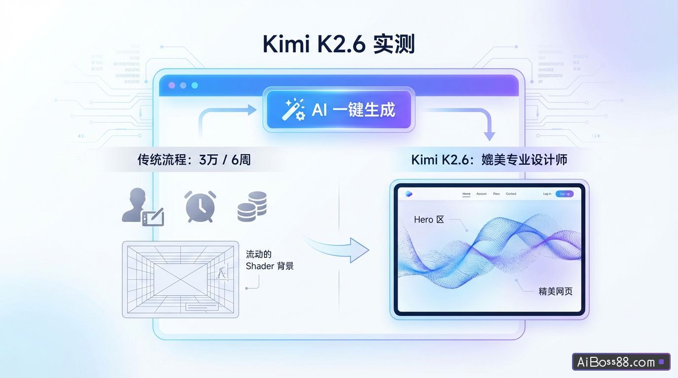
Last year, I created a personal brand website for myself and hired a fairly well-known independent designer on ZCOOL. The quote was 30,000 RMB, with a delivery time of 6 weeks. I was quite satisfied with the design when I received it. The homepage featured a flowing shader background, and the Hero section embedded a video with smooth transition effects.
After I saw that Kimi updated to K2.6, I sent him a request.
Five minutes later, what it vomited, along with the 30,000 yuan manuscript...Almost the same level.
In just one year,AI Can you do work worth 30,000?
So today's article will help you test the true capabilities of Kimi 2.6. I ran all three cases based on the standard that "the customer will actually place an order".Prompt wordsIt's posted under each case; feel free to take it if you want to copy the solution.
The reason this case came about is that a friend of mine runs a craft beer product line and wanted to create a premium product page. He previously outsourced the project and received a quote of 18,000 yuan.
I tried it with Kimi 2.6, and the positioning is...Independent Japanese whisky brand.
Create a landing page for an independent Japanese whisky brand.
Brand positioning: Small-batch handcrafted distillation, emphasizing craftsmanship and Eastern aesthetics.
[Hero Section on the Homepage]
– The background uses Three.js + GLSL Fragment Shader to create a fluid effect:
* Visual simulation of whiskey slowly swirling in a glass.
* The main color is amber #C87533, mixed with dark brown #3B1F0E and gold highlight #E8B547
* The light source is coming down from the upper left corner, resulting in noticeable refraction and highlights.
* The entire fluid breathes slowly (one cycle every 10 seconds).
– The shader must include the following optical details:
Fresnel reflection – edge highlights
Subsurface scattering – light transmission within a liquid
Caustics – Projection of ripples on a liquid surface
- Chromatic aberration – subtle chromatic aberration at the edges of highlights. Refer to the texture of the 'liquid gold' shader on shadertoy.com – brand name on the left side of the foreground (vertical Japanese + horizontal English).
– The right side features a 3D whiskey bottle, rendered using @react-three/fiber.
* The bottle rotates slowly (one revolution every 30 seconds).
* As the roller rotates, the liquid inside the bottle sloshes due to inertia.
* fastRolling → Small bubbles rise to the surface of the liquid.
* Stasis → Liquid slowly returns to horizontal
[Key Point: Ice Cube Cursor]
– When you hover over the whiskey bottle or product card, the mouse cursor transforms into a floating 3D ice cube (transparent with a refractive effect).
– The ice cubes rotate very slightly (once every 5 seconds).
– Leaving the product area, the cursor returns to the default setting [Second Screen: Flavor Wheel] - Interactive circular flavor wheel, hover over to different sectors:
* Sector illumination
* A "smoke" of the corresponding flavor appears in the center (Shader simulation).
* Slide to the right to view flavor description
* Background Shader color fine-tuning to match (smoky → gray-blue, honey → golden yellow)
– Transition animation from the previous screen where the shader "freezes into a wheel"
[Third Screen: Brewing Process]
– A horizontally scrolling timeline, showcasing 5 steps: wheat selection, fermentation, distillation, aging, and bottling – each step accompanied by a black-and-white photograph and text description.
[Fourth Screen: Product Series]
– Three whisky product cards, each featuring a 3D bottle design – the bottle tilts slightly and highlights change as the card hovers.
[Fifth Screen: Purchase Area] - Minimalist purchase button + quantity selection + long brand story text [Style Reference]
– The main theme references the restraint found on the Yamazaki whisky website.
– Product presentation style of the Saturnbird website (saturnbird.com)
– Layout rhythm reference: Linear official website
[Technology Stack] React 19 + TypeScript + Tailwind + Three.js + @react-three/fiber + @react-three/drei + GSAP
ThisPrompt wordsI didn't say "the shader should look good," but instead directly specified several optical terms: Fresnel reflection, Subsurface scattering, Caustics, and Chromatic aberration.
The model shifted gears immediately upon hearing these words..
generally AI The generated shader looks like a "dynamic gradient" because it defaults to the most basic rendering equations. Once you request Fresnel reflection + subsurface scattering, it calls a more complete GLSL code structure. This is the core secret to running a "true shader".
Let's take a look at the results.
The homepage shader is a real shader.It's not one of those cheap, generic CSS gradients. Amber liquid flows slowly across the screen, with Fresnel highlights at the edges, a translucent quality inside, and caustic light spots projected on the surface with ripples. Staring at it for five seconds makes you a little dizzy—that's exactly the feeling I wanted: real wine swirling in a glass.
The flavor wheel screen looks pretty good; "the smoke and background change color in sync with the flavor." This sense of breathing in the overall color tone is something I've only seen on many award-winning websites abroad.
The brewing process screen is the most "design-savvy" and also the most surprising. I thought it would give me a conventional vertical timeline, but it defaulted to horizontal scrolling, contrasting with the vertical rhythm of the previous screens and instantly opening up the page's sense of space. The black and white process photos are handled with restraint, without the cheap feel of overlaid filters; this attention to detail is a huge plus.
It does have its flaws. 3D models are indeed performance-intensive on low-end devices; when I opened it on my 5-year-old MacBook Air, the fan was blasting. This can't be entirely blamed on Kimi; complex shaders combined with high-precision 3D models are inherently demanding. However, it doesn't proactively implement performance degradation solutions, such as reducing the pixel ratio, disabling high-cost effects like subsurface scattering when low-end devices are detected, or simply reverting to 2D display. In this regard, its current approach lags behind that of an experienced front-end developer.
My vision for Kimi is: an independent perfumer named Lina who studied in Kyoto for eight years, and whose work is themed around "Oriental herbs".
The reason for choosing "perfumer" instead of the more common "photographer" is that the identity of a perfumer inherently possesses an Eastern aesthetic quality, which is suitable for creating a "high-end" feel and is a better test of Kimi2.6's skill level. The first thing to do in Vibe Coding is to give the model a concrete, imaginable protagonist, rather than empty talk like "making a beautiful website".
Below is the complete version I used.Prompt wordsYou can directly copy and paste:
Please help me create a website showcasing the personal portfolio of an independent perfumer.
Background: Her name is Lina. She studied perfumery in Kyoto for 8 years, and her works are themed around "Oriental herbs".
[Hero Zone Background on First Screen]
– Pure black background #0A0A0A
– A wisp of vermilion-red smoke (#C9302C gradient to #8B1A1A) slowly rises from the bottom left of the image.
As the smoke rises, it gradually diffuses and fades, dissolving into a faint vermilion mist at about two-thirds of the way up the image.
– The smoke has a very slight lateral drift (swaying left and right by 2-3 pixels), simulating airflow in a windless environment.
– The cycle time is 8 seconds. During the cycle, new smoke rises from the bottom and old smoke dissipates at the top, ensuring that there is always smoke in the image.
– The smoke is generated using Three.js + Fragment Shader (volumetric smoke shader, see "volumetric smoke" examples on ShaderToys).
– A layer of extremely fine film grain filter is superimposed on the entire surface, with a grain size of 0.3px and a density of 15%.
– There is a very faint orange-red halo (#8B1A1A, 20% transparency) in the lower right corner, suggesting the location of the light source for the "incense burner".
[Style Reference] - Layout reference: Linear official website (linear.app)
– Texture reference: Lando Norris, Awwwards 2025 award-winning work (created by OFF+BRAND studio, searchable at awwwards.com)
– Elegance Reference: Brand Website Designs from ZCOOL's 2024 Top 100 Designs List - Color Swatch: Main Color: Ink Black #0A0A0A, Warm Beige #F5F0E8, Vermilion Red #C9302C
– Font: Main headings: Instrument Serif / Canela / Editorial New (choose the best); Body text: Inter / Söhne; Decorative Chinese characters: Source Han Serif
[Key Feature: Ink cursor]
– Hide the default mouse cursor and replace it with a moving ink dot.
- When the mouse moves, it leaves a trail of ink that gradually fades and diffuses. - When hovering over a clickable element, the dot enlarges and the ink fades.
– This effect should be consistent throughout the entire site.
Page Structure
Hero First Screen (Full-screen video)
About Section: Text on the left, image on the right; the image is a black and white photograph of her in her studio.
Works Section: Fragrance artwork display, cards unveiled from left to right using clip-path animation.
Process section: A horizontal scrolling timeline of the perfumery process.
Contact Area: Minimalist Appointment Form
[Technology Stack]
React 19 + TypeScript + Tailwind + GSAP + Three.js + @react-three/fiber + WebGL Shader
The video blending on the first screen is very detailed. The flames in the background are clearly distinguishable as inner and outer flames, and they dance in rhythm with the cursor as you move over them. This kind of detail is something my designer paid extra for back then.
The ink cursor was what made my friend's first reaction upon seeing it: "Wait, what's going on with this mouse?" By default, the mouse cursor is hidden and replaced with an ink line; moving the mouse and dragging it creates a slowly spreading ink trail.
Of course, it's not without its flaws. In portrait mode on an iPad, the video in the Hero area sometimes overflows in the responsive design. I asked it to fix this, and it fixed it on the second try. What I'm satisfied with is its ability to handle single-point modifications without "optimizing" other areas as well. Previously, when I asked a model to change a button color, it would conveniently rewrite my entire navigation bar, causing my blood pressure to spike instantly.
The first two cases were about aesthetics. But this case is about...This thing can actually generate income online..
Because I saw K2.6AgentThis time, not only was the front-end upgraded, but back-end functionality was also added.
Therefore, I set up a very specific scenario:Peggy, an independent yoga teacher who has been teaching Yin Yoga in Bali for 10 years, needed a SaaS system that would allow students to book appointments online..
Full-stack applications shouldn't throw all requirements at once; they need to be discussed in rounds. This way, the output of each round is verifiable, and the model won't get lost. I used four rounds.
Round 1: Create an aesthetically pleasing website front-end.
Please help me create a personal website for Peggy, an independent yoga teacher.
She has been teaching Yin Yoga in Bali for 10 years.
[First Screen]
– Hero's background is a looping video of yoga on the beach at sunrise (placeholder).
– The main title uses an elegant serif font, fading in slowly.
– There is a CTA button for "Book a Private Lesson" [Style Reference]
– For layout and restraint, refer to the Linear website (linear.app).
– Atmosphere reference: Igloo Inc, an Awwwards 2024 SOTY award-winning work (available at awwwards.com)
– Color palette: Main color: off-white #F8F5F0, accent colors: grass green #6B8E5A and terracotta #C68B6A
– Font: Instrument Serif for main headings, Inter for body text
Page Structure
- Hero homepage
- About the District (Lina's Story)
- Course Introduction (Three Courses)
- Student reviews
- Contact information
[Technology Stack]
For now, use React 19 + TypeScript + Tailwind + shadcn/ui + GSAP to only develop the front-end pages, not the functionalities.
After the first run, I was a bit surprised. The Hero video of the sunrise at the beach, the off-white main color scheme, and the azure sea—the overall feel of a boutique yoga studio exuded restraint and relaxation. The Instrument Serif font for the main title perfectly complemented the "Yin Yoga" aesthetic. If I took a screenshot and posted it on WeChat Moments, I doubt anyone would guess it was... AI Made.
Round Two: Adding a User System
Excellent. Now let's add a user system to this website:
Students can register and log in using their email address.
– Use Supabase as the backend
– After registration, there is a personal center page where you can see your avatar and appointment records.
- Login state should be persistent (not lost upon refresh).
– The error message in the registration form should have animation effects (shaking + red border).
The pleasant surprises in this round are the details of persistent login state and form animations. It didn't just implement the bare minimum to "run," but instead considered true login state persistence by default.practicalUser scenario: Refreshing doesn't disconnect the connection, error messages have a jitter feedback, and input boxes have a focus animation. Supabase's environment variables are configured entirely by itself; I didn't touch a single line of configuration code. Previously, I thought "adding login" would be a task that required an hour of IDE time, but this time it ran in 6 minutes, and the avatar and appointment record area in the user center were already there.
Third round: Add an appointment system
Now, a reservation function has been added:
– I offer 3 types of courses:
* One-on-one private coaching (¥800/session)
* Small group class (¥300/session)
* Trial Class (¥0)
Students can select the date, time slot, and course type.
– Write to the Supabase database after successful booking
– The booking page should include a calendar component, with fully booked time slots grayed out and unselectable.
[Highlight: The "Lotus Blossoms" - a successful reservation]
– After the student clicks "Confirm Reservation", it is not...Simplepop-up window
Instead:
The entire screen dims.
* A lotus flower slowly blooms in the center (SVG animation)
* Below the lotus flower, the message "Your time has been preserved for you" is displayed along with the specific date and time. * The background features gently falling petals (particle effect).
* 5 seconds laterautomaticJump back to your profile
The first version of the calendar component was...It's at a level that allows it to be launched directly.All slots are booked.automaticThe grayed-out and unselectable states have tooltips, and the time picker for mobile devices has been adapted separately. The part I most want to replay the screen recording of is the "lotus blooming": the screen dims, the lotus unfolds petal by petal using SVG path animation, the petal particles slowly fall, and the message "Your time has been preserved for you" fades in. The whole process takes 4 seconds, but it really captures the sense of "ritual".
I wasn't satisfied with the first version of the lotus blooming effect, so I asked Kimi to optimize only that part. He really only changed that one part, and he finished it very quickly. Isn't this version much better?
A person who can make "lotus blooming" AIAnd a device that only displays "Reservation Successful" AIThere were ten designers in between.
Round 4: Add administrator backend
Finally, create the admin backend, where only the admin account can log in:
Dashboard
– Today's bookings, this week's revenue, and new student numbers (with scrolling animation).
– "Today's Energy Map" module:
* Displays the teacher's course schedule for today (timeline style).
* Each class is represented by a dot, size = number of students, color = course type. * Hover over to show details - this month's appointment trend line chart (using recharts).
[Appointment Management]
– The table displays all appointments and allows filtering and cancellation.
– Style reference: Linear's official website product interface (linear.app) [Student Management]
– List of all registered students [Overall Style]
– Use shadcn/ui
– Table design reference: Linear's Issue list view
The Admin backend is the screen in the entire case that truly elevates the overall experience for me. The non-standard "Today's Energy Map" component wasn't skimped on; the dot size corresponds to the number of students, the color to the course type, and the hover overlay displays details. Combined with Recharts' line chart and scrolling number animations, the information density and granularity of this backend are truly impressive.It's almost as good as the legitimate SaaS products I usually use..
The final step, and the most crucial one.:
Please deploy this application to Vercel and provide me with a URL that is actually accessible.
The front-end is deployed to Vercel, and Supabase is used as the back-end service, with the environment variables configured correctly.
A dozen minutes later, I received these items:
Front-end official website + student registration and login + course booking system + administrator backend + data visualization + real database + a real and accessible online URL.
After testing these three cases, I feel that Kimi 2.6's aesthetic sense has truly improved significantly. Top designers don't need to worry about her for now.But the 90% of the outsourcing market in the middle is definitely going to be in serious turmoil..
in addition,The concept of full-stack development is more imaginative than aesthetics.Because aesthetics are icing on the cake, while full-stack development is building from scratch. Previously, with Vibe Coding, you got a pretty shell. Now, with Vibe Coding, you get a business that can generate revenue, retain leads, and operate. A yoga teacher no longer needs to spend 20,000 yuan outsourcing a booking system, and a coffee shop owner no longer needs to spend 10,000 yuan on a brand website. This is far more important than "model benchmarking."
Finally, to be frank, Kimi has indeed reached the top tier in terms of aesthetics. In cases with high front-end complexity, the stability of shaders and 3D effects is better than I expected.
We talked a few years ago AIWe were talking about "whether it's possible to do it." Last year we talked about... AIWe used to talk about "whether it looks human." Now, when we talk about models like Kimi 2.6, we're talking about "whether the aesthetics are sophisticated enough."The change in evaluation dimensions itself illustrates...AIProgress.
AI They began to compete with humans for the territory of "taste".
Original link:K2.6 minor update, big leap forward! Real-world testing shows it surpasses the website I paid 30,000 RMB to have designed.